This multi-part lesson is all about the color Violet, or Purple. (I use these two names interchangeably)
Here are 10 things that I think you should know about this color . . .
1. Violet is one of the secondary colors, along with Orange and Green. A secondary color is created by mixing together two of the primary colors (in this case, Blue and Red).
2. In its darkest values (like Eggplant), Purple is rich, dramatic, and sophisticated. For a rich, dark Purple, start with Alizarin Crimson (a cool red) and add French Ultramarine. This looks beautiful next to a golden glow.
Lighter shades of Purple, like Lavender and Lilac, bring a more restful quality to a painting.
Purple embodies the balance of Red stimulation and Blue calm.
3. The complementary color of Violet is Yellow. The Violet/Yellow harmony can be summed up in a single word -- exotic! This Violet/Yellow chord has little connection with everyday experience -- except in irises and violets, rare butterflies, tropical birds, and amazing sunsets.
If you put these two complements next to each other, they make each other more vibrant. If you mix the two together, it grays them down.
4. The Secondary Triad -- Violet/Orange/Green -- is a wonderful and very powerful color scheme. This is one of my favorites!
5. I prefer to mix Purples from the Reds and Blues on my palette, rather than using tube Violets. The results are Violets that are glowing, alive, and contain enormous strength.
If you feel you must have a tube Violet on your palette, try Winsor Violet, Quinacridone Violet, Cobalt Violet, or Mineral Violet.
6. To mix vibrant, high-intensity Violets -- use cool Reds, like Quinacridone Rose, Alizarin Crimson, or Quinacridone Magenta; and mix with a warm Blue, like French Ultramarine.
7. Use the Red-Violet hues for a warm color scheme, and the Blue-Violets for a more somber, cool color scheme. Lavender suggests the feminine, and dark Purple (Eggplant) can suggest the masculine.
In stained glass, the color Purple, or Violet, is seen as the uniting of the "wisdom" of Blue and the "love" of Red, and symbolizes justice and royalty.
8. Purple is regal, wise, and spiritual. As a complement to Yellow-Green, it's a good color for spring landscapes and still lives. Try adding a few spots of Purple/Violet, here and there.
In fact, Purple is an ideal color to enhance or enliven almost any painting subject, including mountains and winter scenes. These both provide a great opportunity to use Violets. Long shadows on snow have shades of pinks and blues in them. And, a rainy day can have a Blue-Violet tinge to it -- even a sky can sometimes look Purple.
9. Try doing a "Paint Shadows First" painting -- like we did in Lesson Two (Values) -- where you do a value painting first, using Violet. Then, after getting the values right, you glaze color over it. Push the underpainting towards Red-Violet for the warms and towards Blue-Violet for cools.
10. In your watercolor sketchbook, or on a small scrap of watercolor paper, try out some color combos, for beautiful Purples/Violets/Lilacs/Lavenders. Know that just by adding some water to a Purple or Violet combination, you will get your lilacs and lavenders. For these color combinations, use cool reds. If you mix warm reds, like Cadmium Red, to a blue, you end up with a mauve color, not a brilliant Violet.
Here are some combos to try:
- French Ultramarine + Quinacridone Rose
- Cobalt Blue + Quinacridone Rose
- Alizarin Crimson + Cobalt Blue
- French Ultramarine + Alizarin Crimson
- Quinacridone Magenta + French Ultramarine
- Quinacridone Magenta + Cobalt Blue
- Phthalo Blue + Quinacridone Magenta
- Phthalo Blue + Alizarin Crimson
- Cobalt Blue + Quinacridone Rose + touch of Quinacridone Burnt Orange
- Quinacridone Rose + Phthalo Blue
(Note that whenever you use Phthalo Blue (aka Winsor Blue) or Alizarin Crimson in a mixture, they are each so strong that they will easily take over a mixture. So, be stingy with those in your combinations.)
"I think it pisses God off if you walk by the color Purple in a field somewhere, and don't notice it."
- Alice Walker
Monday, February 17, 2014
Wednesday, December 18, 2013
LESSON VIII - Part 4: Painting Pumpkins
In this painting project of pumpkins and melons, we will be doing wet-in-wet minglings, negative painting for depth, and transparent layering -- as well as using warm colors in the foreground and cool colors in the background.
Prep the following paints for your underpainting: New Gamboge, Quinacridone Rose, and French Ultramarine.
For your underpainting, first wet your paper with clear water. Then, paint the Yellow in the bottom third, the Rose in the middle third, and the Blue in the top third, letting them mingle together. Spatter some of these colors, too, and lay it flat to dry. When there is just a sheen on the paper, sprinkle some salt all over . . .
When the paper is totally dry, brush off the salt. Use your fingernail or a credit card if you need to -- just make sure all the salt is off . . .
Draw two big pumpkins in the foreground -- one slightly below and overlapping the other one. Indicate a shadow under the back pumpkin.
Paint the negative shapes -- the area around the pumpkins -- with the Quinacridone Rose and the French Ultramarine. You can wet the area first, if that is easier for you. (Hint: Turn your painting upside down to paint the negative space. Start painting with the Rose wash around the pumpkins, painting right over the shadow shape, gradually changing to a Blue wash.)
After this is dry, draw about three more pumpkins (or partial pumpkins) behind the foreground pumpkins. Then, paint a pale Blue wash over the negative shapes.
When this is dry, draw a pile of pumpkins, melons, and gourds in the background -- a variety of shapes. Also, draw a simple rectangle shape, to indicate a box or bin.
Using a pale wash of Quinacridone Magenta, paint the background negative shapes. Paint over the box shape and the shadows under the foreground pumpkins with this Magenta wash, too.
Now that we've established the depth with the negative painting, we can start developing the pumpkins, with transparent layering. Working one shape at a time, paint the foreground pumpkins with transparent washes, mingling Yellow, Red, and Burnt Orange (or Burnt Sienna). Paint every other section within each pumpkin, so the adjacent shape isn't still wet. For the background gourds and melons, use Burnt Orange on some and Sap Green on others.
Continue painting this way, shape by shape, until you've painted all the pumpkins and melons and gourds. Be sure to stay transparent, so that the underpainting and texture can still be seen.
Mix up two different darks -- 1) Magenta + Burnt Orange, and a slightly darker one, 2) Magenta + French Ultramarine + Burnt Orange. Paint the stems and the part of the shadow directly under the pumpkin. Add some darks to the foreground pumpkins, to give them more form, if necessary.
Finish your painting with some Blue glazing on the background gourds, more darks on the stems, and a dark Blue wash on the background box shape (French Ultramarine + Magenta + Burnt Orange).
Tuesday, December 17, 2013
LESSON VIII - Part 3: Painting a Sunset by Layering Washes
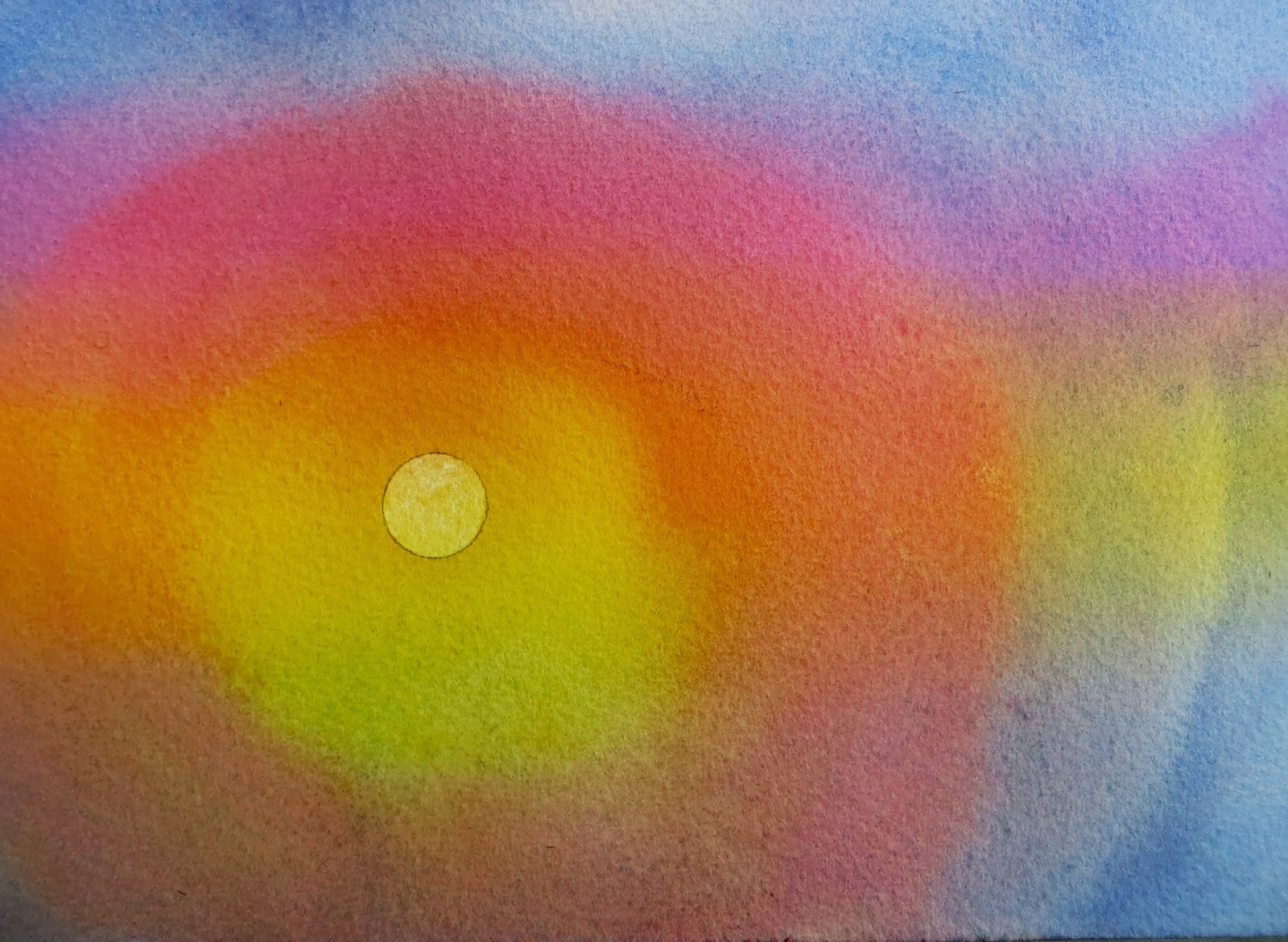
In this project, we will be using a Primary Triad (Yellow/Red/Blue) as a color scheme. We'll paint a simple sunset with just 3 watercolor pigments -- with minimal drawing and layering washes.
I chose a version of the Primary Triad for this project -- Magenta/Yellow/Blue. I used Quinacridone Magenta, Aureolin Yellow, and Cobalt Blue. Just use these colors, or something similar. This bold and energetic color scheme should work well for painting a sunset.
Prep your watercolor paper (approx 6" x 8"), and your three pigments. These are the only three pigments you will use for this exercise.
After wetting the paper, evenly, with clear water, apply each of the colors, using horizontal strokes. Start with the blue across the top, then brush on the magenta (overlapping the blue a little), then the yellow (overlapping some of the magenta), then the blue again (overlapping some of the yellow). Carry the blue all the way to the bottom.
If you have puddles of water/paint, set the paper/board on its side, so that the paint will run off. Then, lay it flat to dry.
When it is totally dry, use a pencil and a template to draw a small circle for the sun. This should be in the bottom half of your painting, on the yellow part. (Just don't put it right smack in the middle of the painting.)
You will also need some masking fluid and some way to apply it. (I use a quill pen, which is super easy to clean and works great for small shapes and delicate lines.) Pour a little masking into another small container, and add a little bit of water, just to thin it. It will still resist the paint, but this makes it easier to apply.
Apply a thin layer of the masking fluid to the moon shape, using a quill pen. Try to get an even line around the edge of the shape. Rinse off the nib of the pen, and then clean it off with your fingers, so it's ready for the next time.
If you don't like the way you applied the masking, or if you dripped it onto your painting -- just rub it off and try again.
Make sure the masking fluid is totally dry before you start painting again.
Prep some more of those same three colors. Wet your paper again, and this time, starting with the yellow, brush on your paint in a circular motion. Paint right over the "sun" and continue beyond that, then paint the magenta in a circle, overlapping the yellow a little. Then finish with the blue, overlapping the magenta, and then taking the blue out to the corners and edges. Let this dry flat.
After the paint is completely dry, remove/rub off the masking from the sun shape.
Using those same 3 colors again, paint the horizontal stripes again. (Wet the paper first with clear water, and wet right over the sun shape.) Paint in this order: Blue, Magenta, Yellow, and Magenta. (No blue at the bottom -- bring the magenta all the way down.)
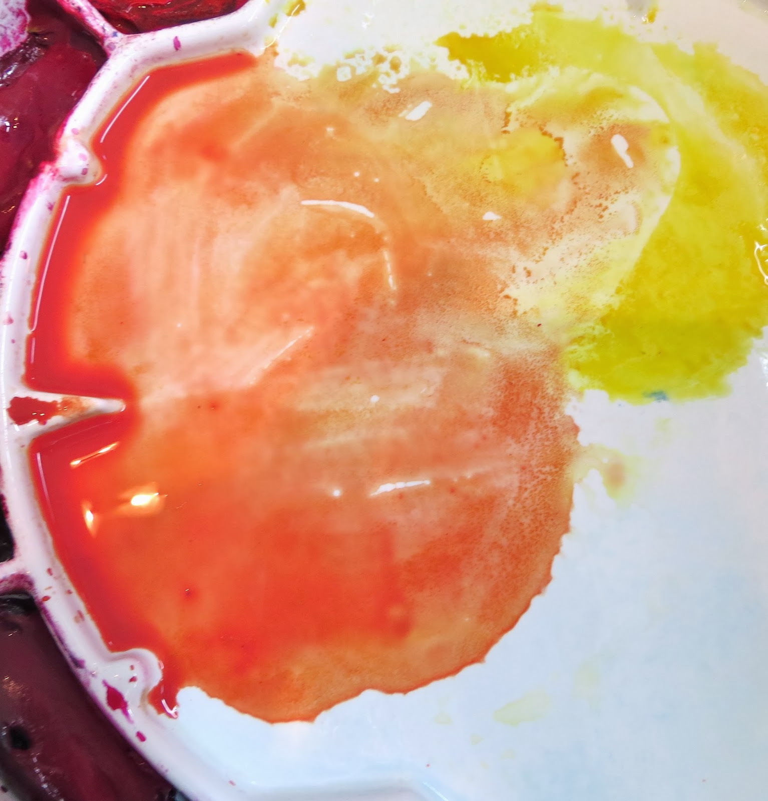
While this dries, clean off the Blue from your palette. Then, mix the Yellow and Magenta together, with some water, to make an "Orange-y" wash.
Using this Orange wash, paint the bottom third of your paper, forming the ground. (Don't wet the paper first -- so mix enough water into the orange to cover the whole shape.) Overlap the bottom of the sun. You can draw this in pencil first, if you want -- and it doesn't have to be an even edge. When this just starts to dry, make one or two horizontal passes with a damp brush.
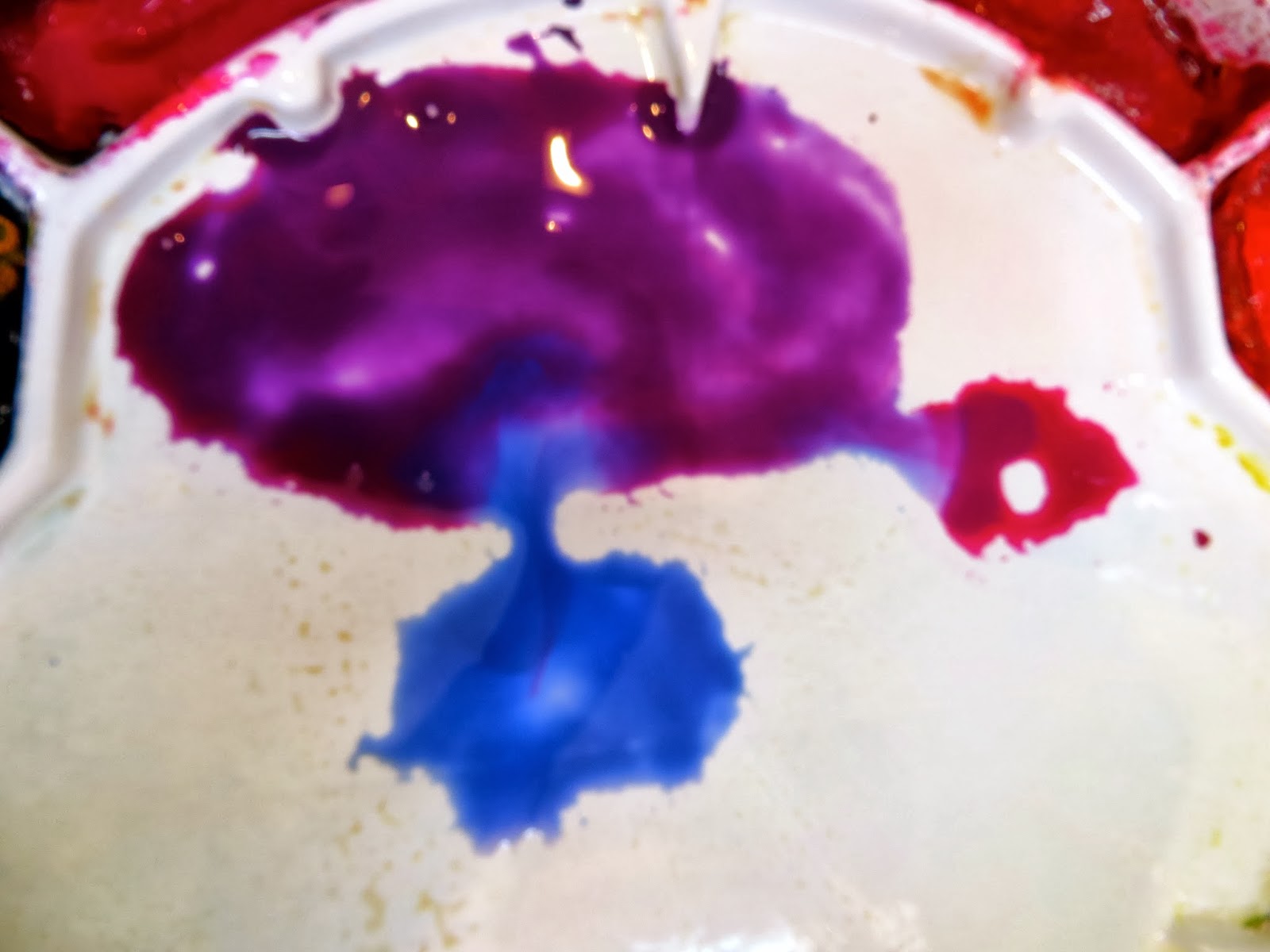
Clean off the orange mixture from your palette, and mix up a purple mixture, using the magenta and the blue.
Use this purple mixture to paint over the orange "ground" shape, leaving just a sliver of orange at the horizon. Have enough of a wash mixed up to cover the entire ground shape. Don't wet the paper first -- you're painting wet-on-dry. When this just starts to dry, make a few horizontal strokes with a damp brush, to give it a little texture and to let some of the orange color show through.
And you're done! Exploring the interaction between colors is a never-ending process -- there's always something new to learn!
Monday, December 16, 2013
LESSON VIII - Part 2: Orange Color Studies & Some Things to Know About Orange
Orange is another secondary color, made up of Red and Yellow.
You don't really need a tube Orange on your palette, since it is easy to mix an Orange with any Red and Yellow. You can mix many different shades, between Red-Orange and Yellow-Orange. And, many of the tube Oranges are not lightfast, so I always mix my oranges. A really beautiful Orange is made with New Gamboge and Quinacridone Rose. I even use that mixture, watered down, for flesh color in my portraits.
1. COLOR MIXING OF ORANGES
Flesh-Tones. Do a page of Flesh tone mixtures, which is really just a pale orange.
You don't really need a tube Orange on your palette, since it is easy to mix an Orange with any Red and Yellow. You can mix many different shades, between Red-Orange and Yellow-Orange. And, many of the tube Oranges are not lightfast, so I always mix my oranges. A really beautiful Orange is made with New Gamboge and Quinacridone Rose. I even use that mixture, watered down, for flesh color in my portraits.
1. COLOR MIXING OF ORANGES
Flesh-Tones. Do a page of Flesh tone mixtures, which is really just a pale orange.
Use different combinations with the Reds and Yellows that are on your palette right now. Make notations right on the paper, so that you remember what colors you used.
Orange Grid (a la Paul Klee) -- Draw a grid of squares, and in each one, make a notation of the color you will try to achieve there. (And, include one Blue square, just for contrast). Then, paint each square, either mixing the color on the palette first; or, wet-in-wet mingling (water first, then add the colors to the wet square and let them mix on the paper.)
The complement of ORANGE is BLUE. When placed right next to each other, they really pop. Mix them into each other to create Browns. Orange and French Ultramarine, especially, make colorful neutrals.
A very versatile and effective complementary color combo is Quinacridone Burnt Orange and French Ultramarine. This is a good color scheme for landscapes. And, when mixed together, these two colors make a lovely gray (similar to Payne's Gray). When your painting is mostly Orange, the French Ultramarine can be added to make a nice dark.
2. PAINT A "FEELING" OF FALL -- Don't draw first. Just paint a simple little landscape, using oranges and other autumn colors, with just a touch of blue.
3. PAINT A BOUQUET-- Look at a bouquet of orange flowers, or part of a bouquet which contains some orange flowers, and start painting the color and shapes, without drawing first. Mix the oranges right on your paper. Let that dry -- and then come in with a black ink drawing.
4. CARROTS -- Buy some carrots, with the greens still attached. They are more fun to draw and paint that way. Draw them, and then paint with watercolor. Do a yellow underpainting on the carrot and the greens. Then, paint the rest of the background a light blue. Mingle the Oranges in the carrots, using Yellow, Burnt Orange, and a warm Red like Cadmium Red. Leave some of the yellow showing, especially in the middle of the carrot, to give it a rounded look. Then, use the blue to paint a cast shadow.
ORANGE is a warm color, that visually comes forward. It can have an exciting effect in a painting.
5. ORANGE-LINE DRAWING/PAINTING -- Set up a still-life, or look at your pet. (Use a photo, if your pet won't sit still.) Mix up an orange paint with your watercolors, and start "drawing" the shapes with your brush and the orange mixture -- no pencil drawing first. Start in the middle, and keep drawing shapes until you run out of paper. Then, fill in the shapes with mingled colors -- exaggerate the colors! Paint up to the orange line, but not over it, so that you get the nice contrast.
6. AUTUMN LEAVES -- Collect some leaves from outside, or find pictures of leaves, and draw/paint a few small leaf studies, in various ways:
An invaluable ORANGE, that you SHOULD have on your palette, is Quinacridone Burnt Orange -- which is similar to Burnt Sienna, but is very transparent and mixes well. It is more transparent and intensely-colored than the earth pigment, Burnt Sienna. And, it's especially good to use when you need a brown, other than in a landscape; and when you want to darken your oranges.
7. SMALL ORANGE FLOWER STUDIES -- Using a square format, draw a single orange flower blossom, and then paint it.
8. SMALL ORANGE FRUIT STUDIES -- Buy some orange fruit -- preferably, the kind you like, so you can eat it after you're finished drawing/painting. Do a few small drawings, and then paint them, mingling the oranges within the fruit.
Subscribe to:
Posts (Atom)