Monday, September 23, 2013

LESSON V - Part 3: Red Tulips with Black Background


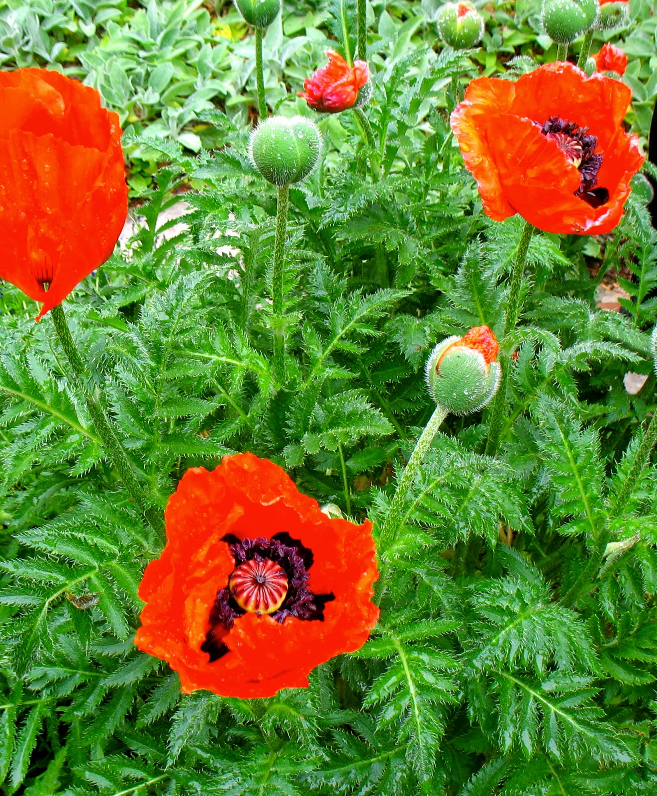
In this red flower project, we'll be mingling 2 or 3 colors in each petal and leaf, and then mixing and painting a black background, to really set off those red tulips.


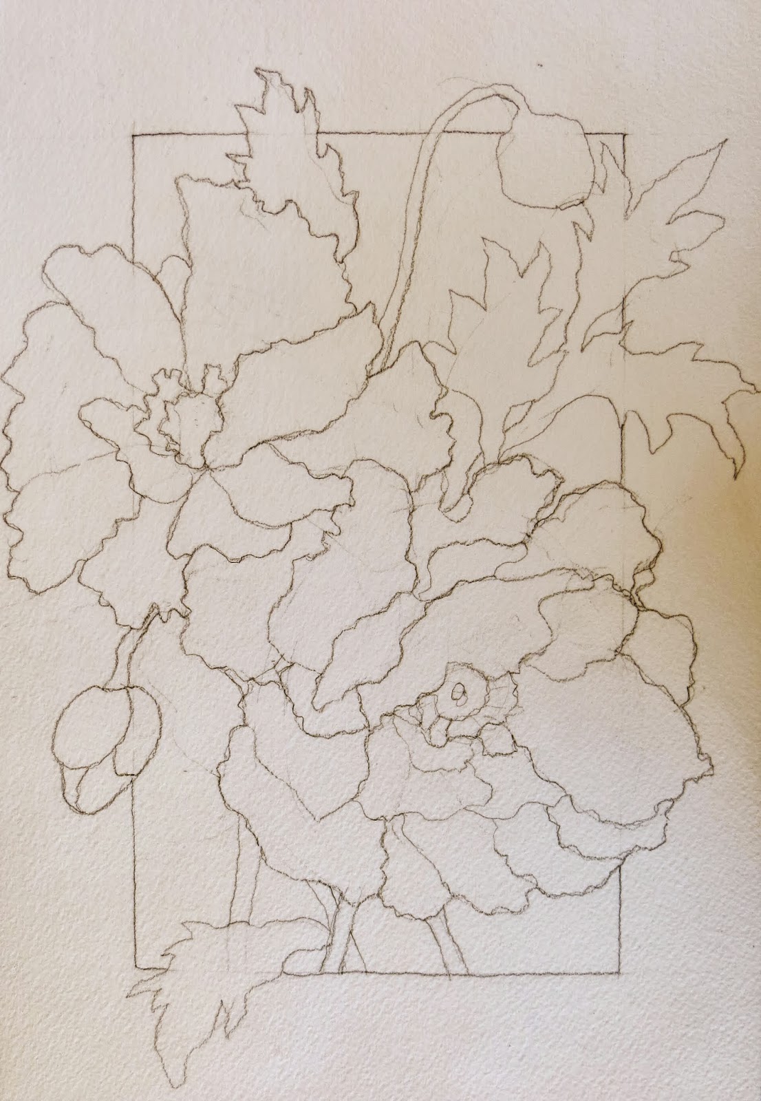
To begin, draw some tulips, stems, and leaves on your paper.  Try to have a variety of shapes and sizes, especially in your negative space . . . 


Next, prep three colors of paint.  For the tulips, choose a YELLOW (like Winsor Yellow, New Gamboge, or Cadmium Yellow); a WARM RED (like Winsor Red, Cadmium Red, or Quinacridone Red); and a COOL RED (like Permanent Alizarin Crimson or Quinacridone Rose).  Prepare them by bringing them into the middle of your palette and adding enough water to activate them.  Make sure there is enough water and pigment in each mixture.  If there is too much water and not enough pigment, you will end up with wimpy-looking tulips; and if there is too much pigment and not enough water, the colors will not mix together well, within each petal, and your petals will look heavy and opaque.


To paint each petal, start painting with Yellow on one edge, directly onto the dry paper.  While this is still wet, start painting the Warm Red, just touching the edge of the Yellow.  Then, while this is still wet, paint the rest of the shape with the Cool Red.  Try to let the colors mix on their own and not "help" them too much with your brush.  We need to remember to let the watercolor do most of our work for us . . . 


If you find it difficult to mingle the colors this way, try painting the entire petal with the Yellow, and while that is still wet, drop in the Red on one side of the petal . . . 


Work your way around your painting, using two or three colors within each shape.  Don't dwell on any one petal -- make yourself move to the next shape.  The watercolor will do interesting things as it dries -- so we have to learn to let things be and not fiddle too much.  And, get that paper towel out of your left hand!  We're painting on a level surface, so the paint is not going anywhere.  If it puddles up within your shape, don't dab it.  Just let it dry on its own, and see what happens . . . 


After cleaning the reds off your palette, prepare new colors for the stems and leaves.  Prep 3 colors:  a YELLOW, a WARM GREEN (like Sap Green), and COBALT BLUE . . . 


Paint each leaf and stem, by mingling these three colors -- just like you did with the petals . . . 


Again, if you find it difficult mingling the color on dry paper, try painting each leaf or stem with the Yellow first, and then dropping in the Green and Blue while the Yellow is still wet.  Work your way around the painting, until all the leaf and stem shapes are painted . . . 


Now, add a few darks to the stems and leaves.  Mix a DARK GREEN (with the Sap Green plus a little French Ultramarine).  Paint this Dark Green in a few spots, like where one leaf is behind another, or where the stem meets the blossom.  Paint a small shape at the edge, and then soften the edge of that shape by touching it with a damp brush.


After cleaning the greens off your palette, mix up two colors of RED -- a BRIGHT RED (like Alizarin Crimson mixed with Winsor Red) and a DARK RED (like Alizarin Crimson mixed with Quinacridone Magenta).  Use the Dark Red to paint some areas where you want one part of a petal to sit behind another, or at the base of a blossom.  Paint the bright red anywhere you want to brighten up the red that is already there -- starting at the Red edge of the petal, and hitting the other edge of the shape with a damp brush.  Don't cover up all the Oranges and Yellows.  And, don't be afraid to leave some of the petals "as is" if you like the way they look . . . 


Now, it's time to decide whether you want to stop here, or be brave and add a black background!  Since this project is also about mixing and painting a black background, I will go on.  But, if you like the way your painting looks with a white background, feel free to leave it this way.  There have been many times that I wish I HAD left the background white.  Unfortunately, with watercolor, there's no turning back once you've committed to the black.  But, what the heck -- let's go for it!

To mix a nice black, use plenty of pigment and water.  If you have too much water, you'll just end up with a washed-out gray. Using the darkest pigments on your palette, mix up a rich Black or Blue-Black.  I like to use Winsor (Phthalo) Blue, Winsor (Phthalo) Green, Alizarin Crimson, Quinacridone Burnt Orange.  You don't need all those colors -- just pick 3 of them and keep mixing and adding, until you get the dark color you want.  Then, start painting the background shapes.


To paint these background shapes, you may want to use two brushes -- a small one with a good point to get into the little narrow spots, and a bigger round that holds more paint.  Switch back and forth between these brushes, picking up more black paint from the palette often, as you fill in the shape.  Use enough water/pigment so that the paint moves easily but you still maintain the dark color.  If you don't have enough paint, the result will be streaky, because you have to use your brush too much.  If you have too much water, the result will be a lighter gray color, instead of the black.


Hope you had success with this project -- I'm looking forward to seeing your painting and hearing about your experience.


Sunday, September 22, 2013

LESSON V - Part 2: Ten Sketchbook & Color Exercises to Try


Try a few, or all, of these exercises, and you'll be "seeing red" -- in a good way, I hope.

For these first 6 RED exercises, you'll need your sketchbook, a pencil, a black pen, some watercolor pencils or colored pencils, your watercolor paints, some magazines (you know you have some old ones lying around), a glue stick or "Yes" paste, and a pair of scissors.


1)  Draw a part of a Red motorcycle, bicycle, tricycle, or wagon -- Draw a contour line drawing with a black pen.  Don't worry about proportions, or whether you've drawn it correctly.  This is your sketchbook -- it doesn't have to be perfect.  "Perfect" is boring, anyway, don't you think?  Then, add some color, with a little Red watercolor.  Add some shadows with cross-hatching in pen and a simple gray wash.  (You can touch the edge of the black pen line with water to make a gray wash).


2)  Take a hike, or walk around a garden with your sketchbook, a black pen, and a small watercolor kit or some colored pencils.  Draw contour lines of the Red flowers you find and some of the environment.  Add some color, and then write a sentence or two about where you are, and then date it.


3)  Draw & paint some RED apples, still on the tree.  First, draw 2 or 3 skinny rectangles on your page, and within that format, draw some apples on a branch, with a few leaves.  Draw this is pencil first.  Then, color the apples Red, the branch dark Brown, and the leaves Green.  Now, fill in the background with a Gold.  You can use watercolor pencils, so you can use a wet brush over the pencil.  This is helpful for covering large areas, like the background.  When this is dry, go over all the lines, including the rectangle, with a black pen . . . 


Design these little rectangles, so that the apples and leaves are cropped, making interesting negative shapes.


4)  Draw the insides of your pantry.  Collect all the bottles/jars/containers from your cupboard or pantry, that contain the color Red (not on the inside, by the outside).  Arrange them on a shelf or two.  Do a contour line drawing with a black pen, adding some cross-hatching.  Then, add a little color, with paint or colored pencils.  Add a few other colors, besides Red, for contrast . . . 


(Now, put everything back the way it was . . . or not.)


5)  Make 2 Red color collages.  Gather some old magazines, and tear out some examples of Red.  After you have a big pile of all different shades and values of Red, cut them into strips . . . 


Make three piles of these strips:  one pile of DARK REDS, one pile of MID-TONE REDS (this will be your brightest pile), and one pile of LIGHT REDS (pinks).

From the middle pile of MID-TONE REDS, arrange them from Red-Violet, to Cool Red, to Warm Red, to Red-Orange.  (This process is more important than the end result -- this is not an exact science).  Now, glue down these strips onto a page of your sketchbook.

Next, using some strips from each of the 3 piles, make an arrangement where you go from Darkest Dark Red to Lightest Light Pink, and glue those down.  

This is a good exercise to do, to train your eyes to see temperature changes within a color family, and to see value changes within that same color family.


6)  With a black pen, draw some Red fruit, and whatever container you brought it home in.  Add a little color, with watercolor or colored pencils.  Then, write in pen, where the fruit came from and what day it is -- and maybe even how it tasted or smelled.  Make your words part of the composition.


For these next 4 color studies, use a watercolor sketchbook, if you have one; or, use scraps of good watercolor paper -- or even a pad of cheap watercolor paper, like 90 lb.  You'll also need a pencil and your paints and brushes.


7)  Red Minglings -- On a few small scraps of watercolor paper, do some wet-in-wet minglings, using all the Reds on your palette.  Wet each paper first, and while it's still wet, drop in the colors.


Now, try another mingling.  But, this time, spritz the paper first, with clear water, then spatter on the Red paints -- all the different shades of Red that you have.  Spritz it again with water, and then spatter on a few other colors.


8)  Red Peppers -- Draw and paint 1 or 2 Red pepper studies, using both Warm and Cool Reds within each pepper.  Leave some white highlights, and you can even paint the green stems for contrast.  Arrange your peppers on a white sheet of paper or in a black bowl.


9)  Imaginary Bouquets (no drawing allowed) -- Paint these bouquets very quickly and very small, so you won't worry about details.  In the first one, paint a few Red tulip shapes, a Blue flower shape, and a few Green shapes to indicate some stems and leaves.  Paint this onto dry paper.


In the 2nd little painting, paint the shape of a bouquet with clear water, and then drop in Red for the flowers, and some Yellow and Blue for the leaves.  When that is dry, paint a Red pot.


10)  Close-up of a Red Flower -- Either looking at a real flower, or at a photo of one, draw it in pencil first.  Then, paint it, petal by petal, wetting it with clear water first, and then using both Cool and Warm Reds in the petals.


Saturday, September 21, 2013

LESSON V - Part 1: Painting Red Poppies


This project is similar to the sunflower challenge in the last lesson, especially in the design and background.  But, in this painting, we will learn how to paint red poppies that really pop!


Gather some poppy references, or use mine -- or use my drawing for your reference . . . 


Draw the poppies onto your watercolor paper, with some leaves and buds.  Then, draw a "frame" around your drawing, but within some of the petals and leaves -- so that it looks as if the flowers are bursting out of the frame . . . 


Now, prepare your paints.  For the poppies, you'll need a Yellow, a Warm Red (like Cadmium or Winsor Red), and one or two Cool Reds (like Quinacridone or Permanent Rose, and Alizarin Crimson).


Working on one petal at a time, mingle these colors, wet-in-wet.  Wet each petal with clear water, and then start with the Yellow on the outer edge of the petal, then add the Warm Red, and then finish painting the petal with the Cool Red . . . 


Don't dwell on any one petal -- just mingle the colors, and then move onto the next.  With some of the petals, start with the Warm Red and then add the Cool Reds to the mingling. 


You'll notice as you're painting, that the colors will dry a little "duller" than when they were wet.  Don't worry about that -- and don't go back into it, at this point.  Just keep painting, working your way around the blossom, until all the petals are painted . . . 


Now that the paint is dry, do another mingling on those petals that you think are too dull.  This time, paint on dry paper, starting with your cool red where the petal "under-laps" the petal on top -- then, add your warm red, then finish the petal with clear water, out to the edge.

While painting, try for the following:  1) Keep it transparent with lots of water, 2) Don't cover up all the yellow from your first layer, with the red, 3) Leave some of the petals that are on top, as is; and 4) Try not to "blot" your painting with a paper towel or rag, as you work.  Even if you have little puddles of paint, try to let them dry naturally.  Since you're working on a level surface, the puddle isn't going anywhere, and if you let the watercolor do its thing, you'll get some interesting results.  The trick is to be "out of control", within a controlled shape. . . 


To set some of your petals back, or under the other petals, paint them now, using Alizarin Crimson, or Magenta, or Maroon.

Then, mix up some dark colors -- Alizarin Crimson mixed with Maroon or Burnt Sienna, a Purple (Alizarin Crimson plus French Ultramarine), and a Black (French Ultramarine plus Burnt Sienna plus Magenta or Maroon).  Paint the dark middles of the flowers -- paint onto dry paper with your juicy mixtures.  First Red, then Purple around that, and then a little Black around the edges of the middle.  This will all mix together, but you will see each of the colors.


Now, paint a yellow underpainting on your leaves and stems . . . 


Paint the leaves and stems with a Green wash (Sap Green, or a mixture of Cobalt Blue and Aureolin Yellow).  Drop in a little Cobalt Blue into a few parts. . . 


We'll finish by painting the background.  We're going to paint WITHIN the frame, and leave the outer frame white.  Mix up a Dark Blue, using French Ultramarine with a little Burnt Orange to darken the blue.  Paint the background shapes, wet on dry.  When the paint is almost dry, mist it with clear water, to get a little texture . . . 


LESSON V - Red


Lesson V is all about bold and bright RED!


Red is the color we associate with dynamic qualities like passion, sexuality, energy, and action; but, it also conjures up things like fire, heat, and danger.  

For centuries, Red has been an important color on artists' palettes.  It's one of the most exuberant colors an artist can add to a painting -- creating excitement and warmth.


Here are 10 important things about the color Red that I think you should know:


1.  You will need more than one red on your palette -- All reds are not created equal, and within the RED family, there is an amazing variety of red to choose from -- ranging from the warmest red-orange to the coolest magenta.  It can get a little confusing; for example, a "true red" is warmer than a "hot pink".  Basically, you should have 1 or 2 WARM REDS and 3 or 4 COOL REDS on your palette.


2.  WARM REDS MAKE BEAUTIFUL ORANGES,  when mixed with yellow.  You really don't need to have a tube orange.  WARM REDS MAKE UGLY VIOLETS, when mixed with any blue.  You really only need one warm red (or, two at the most).  Some possible warm reds are Cadmium Red, Winsor Red, Permanent Red, Quinacridone Red, and Scarlet Lake.  (Cadmium Red is not as toxic as cadmium red pastels, since no dry particles are breathed in with watercolor -- just don't lick your brush).  Winsor Red is a brilliant hue and very transparent for a warm red.  Still, any warm red can take on an opaque quality, if applied too heavily.


3.  ALIZARIN CRIMSON (A COOL RED) MAKES A BEAUTIFUL BLACK, when mixed with Winsor (Phthalo) Green, and IT MAKES A GORGEOUS VIOLET, when mixed with French Ultramarine.  Alizarin Crimson used to be a "fugitive" color, meaning that it would fade over time.  But, you can now buy a "Permanent Alizarin Crimson".  This is a transparent, staining color, that spreads like crazy when applied wet-in-wet.  It can easily take over a mixture, since it's so strong -- which is why its main use is for dark applications.


4.  QUINACRIDONE ROSE (A COOL RED) CREATES A LOVELY WARM GLOW WHEN USED FOR GLAZING.  This cool transparent red (rose) is also necessary when painting flowers and flesh tones.  And, it's great when used as an accent color in cool areas of a painting.  Mingle Quinacridone Rose with Cobalt Blue -- wet in wet -- for clouds, or for shadows on light objects.


5.  TWO OTHER COOL REDS that are nice to have on your palette are QUINACRIDONE MAGENTA AND PERYLENE MAROON -- not necessary, but nice.  Quinacridone Magenta is a strange but beautiful contradiction -- a very cool red that want to be a violet.  Perylene Maroon is a fairly new color for me, but I am growing to love this deep cool brick red.


6.  ARRANGE YOUR REDS ON YOUR PALETTE NEXT TO THEIR "FRIENDLY NEIGHBORS".  Your Warm Reds (Cadmium Red & Winsor Red) should be closest to your orange/yellows; then, your Cool Reds (Alizarin Crimson  & Quinacridone Rose); then, your coolest Reds (Perylene Maroon & Quinacridone Magenta) are closest to your violet/blues.


7.  The inherent value of a RED is medium, or a midtone.  TO LIGHTEN THE VALUE OF A RED, JUST ADD WATER, NOT WHITE.  And, to darken the value of a RED, add a violet or a little blue or green, not black.


8.  RED FLOWERS HAVE THEIR COMPLEMENTARY COLOR GREEN, RIGHT NEXT TO THEM IN NATURE, which makes the RED flowers look even brighter.  Complements enhance each other when placed NEXT to each other.  A green leaf will visually magnify a pink or red flower.  The red color will look closer to you than the green color.  You can also lower the intensity of the red flower by adding a touch of green to it, which neutralizes it a bit.


9.  WHEN PAINTING A RED SUBJECT, USE BOTH THE WARM AND COOL VERSIONS OF RED, WITHIN THE SAME SUBJECT.  Red can look dull and boring very easily, believe it or not.  So, try mingling the warm and cool red together, on the paper.  Also, a yellow underpainting can add vibrancy and warmth to your mingled reds.  And, after the red dries, losing some of its intensity, you can apply a 2nd wash of the mingled reds, to achieve saturation, but still be transparent.  


10.  RED CATCHES YOUR EYE AND ADVANCES IN YOUR COMPOSITIONS, BUT too much of a good thing, with no contrast, can have the opposite effect.  Contrast can be more powerful than the intrinsic power of a color.  Red will demand your attention and appear to come forward, when compared to other colors, like dark blue, which appears to recede in space.  When surrounded by other warm colors, like warm greens and golds, red will shine.


I hope you have fun with the different parts of this lesson --

Part 1:  Painting Red Poppies

Part 2:  Ten Sketchbook/Color Exercises to Try

Part 3:  Painting Red Tulips with Black Background