Thursday, June 20, 2013

LESSON I - Part 5: Five Watercolor Techniques for Trees


There are almost as many ways to paint trees, as there are artists to paint them.

Here are 5 different tree studies, with a variety of approaches you might try . . . 


1.  BASIC TREE STUDY -- 

Sketch a tree in pencil, and then lay in the foliage and grass, with a light mingling of yellows and greens (I used Quinacridone Gold and Sap Green.) . . . 


Wet each shape again, and add some darker/cooler greens and blues (Quinacridone Burnt Orange/ Sap Green, and Sap Green/Cobalt Blue), to suggest volume.  Keep the first light/warm wash visible at the top of the clumps . . . 


When this has dried, paint the trunk, branches, and a simple cast shadow (using Quin. Burnt Orange, Perylene Maroon, and French Ultramarine, or something similar).  Add a few dark marks for emphasis in the leaves . . . 


2.  UNDERPAINTING/SALT/NEGATIVE PAINTING -- Tree in Autumn

Do a wet-in-wet mingling of warm colors.  When the wash has just a sheen to it, sprinkle on some salt, and let it dry completely . . . 


After this is dry, brush off the salt, and draw a simple tree and grassy foreground line.  Paint the negative shapes only, with a mingling of colors (golds, oranges, reds, and a bit of green.)


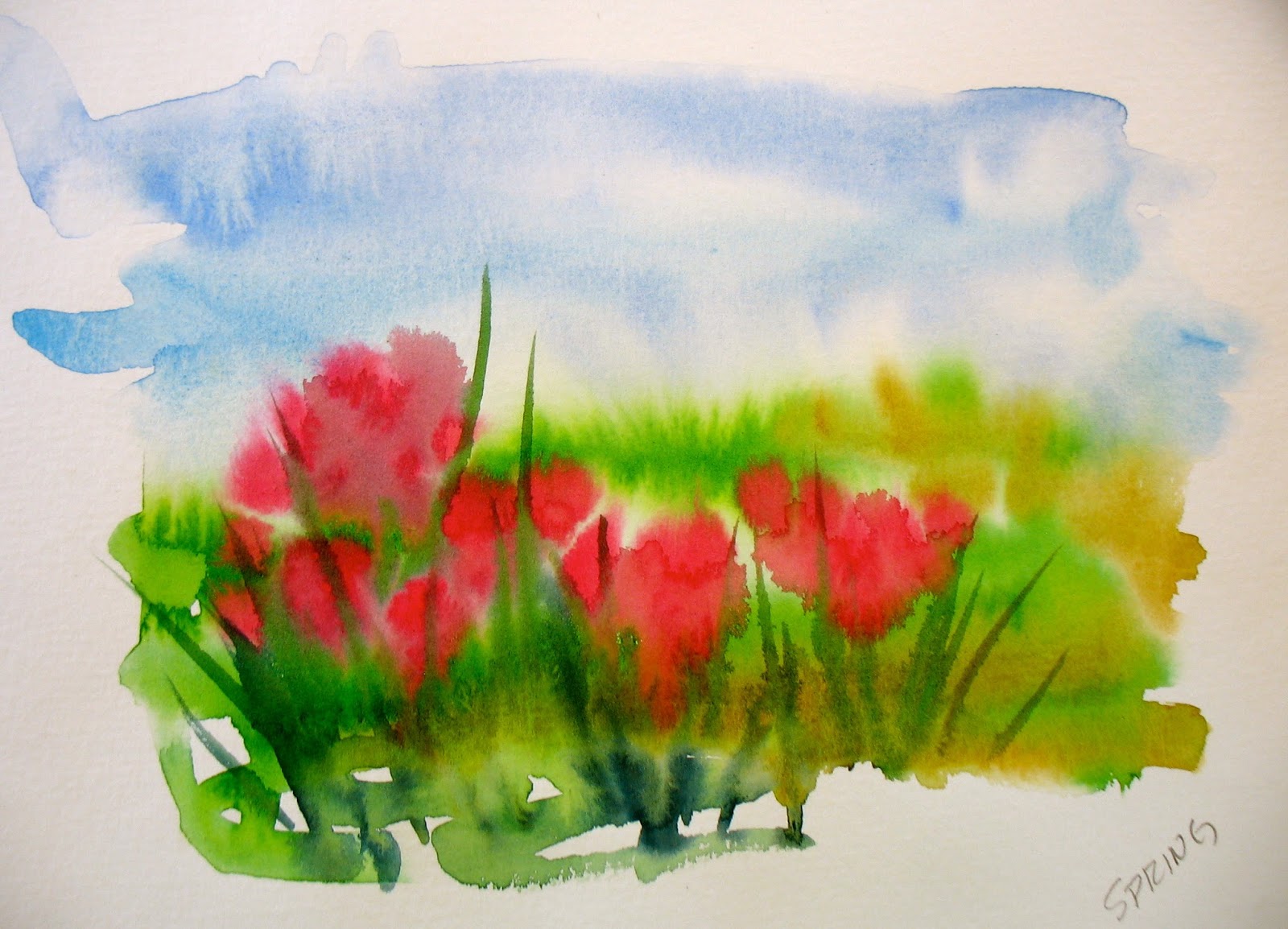
3.  SPATTERING/MISTING -- Flowering Tree in the Spring

Draw a tree, lightly, in pencil.  Paint the trunk and branches first . . . 


Loosely cover up the areas that you don't want spattered, and mist the exposed area with clear water . . . 


While these drops are wet, spatter some pinks and reds and magentas, and a little green.  Use a brush for this, tapping your finger to spatter the paint.  Then, spatter on some clear water, and then touch some of these drops with a brush loaded with the paint (pink, red, or magenta).  Let your brush "dance" across the paper, dropping in paint in a "lacy" way . . . 


4.  MASKING & MINGLING -- Palm Trees

Draw a palm tree, or two, in pencil.  Then, paint a wet-in-wet underpainting, with Quinacridone Gold, Cobalt Blue, and Quinacridone Rose . . . 


Using watered-down masking fluid and a quill pen, apply the mask to the negative shapes (everything other than the palm trees).   Apply the masking fluid with a Q-tip in the big shapes.


When the masking is completely dry, mist your paper with clear water, and mingle and spatter your  colors (the gold, burnt orange or burnt sienna, and sap green, for the mingling; and cadmium red and cerulean blue, for the spattering) --


Let all this dry completely, and then remove all the masking (with a rubber cement eraser, or your fingers) . . . 


5.  RAINBOW OF BACKGROUND COLORS -- Stylized Trees

In pencil, draw a group of stylized trees -- with interweaving trunks and branches, but no leaves.  Take them right off the top and sides of your paper.  Then, draw a few wavy, horizontal lines, behind the trees . . . 


Leave the trees white, and paint the background shapes, in a rainbow of colors.  When the background is dry, erase all the pencil lines . . . 


LESSON I - Part 4: PAINTING CHALLENGE - A Grid of Leaves


For this painting challenge, prep a piece of watercolor paper, approx. 10" x 10", on a board, either stretched or taped.  Draw a 9" x 9" square, and then divide that square into nine 3" squares.  

Now, choose 3 pigments to use for your underpainting.  (I used yellow, rose, and cerulean blue -- a primary triad.)  Paint a separate wet-in-wet mingling in each square.  In some of the squares, use all 3 colors.  In a few of the squares, use 2 of the colors.  And, in the last few, use just one color and some water.  Keep in mind that this is an UNDERPAINTING, so keep it pretty light.  You'll be adding a drawing and more washes on top of this, so you don't want to get too bright or too dark at this stage.


While this is drying, find some references for your leaves -- either real leaves or photos of leaves.  

When the paper is dry, paint your leaves in each square.  Actually, you're painting the veins of the leaves and not the leaves.  Notice that I haven't painted the outside shape of any leaf.


Now comes the fun part.  Paint each shape, leaving the veins un-painted.  Each shape will have just two colors -- paint the first color over the entire shape, and then just touch the edge of the shape with the 2nd color, right next to the vein.  Let that color mingle with the first color -- don't do too much fiddling with your brush to make them mix.  If it's not mingling -- if it looks too much like an outline -- it's because you're not using enough water with your first color.  If it is too dry, your color won't mingle nicely.  


Keep painting until you've painted all the shapes with beautifully-mingled colors.

These paintings are from my workshop last year . . . 


I can't wait to see yours!


LESSON I - Part 3: Mingling Paint on Paper


This mini-workshop is all about mixing (mingling) watercolor on the paper, using the movement of the paint on the surface. . . 


Using a 1/4 or 1/8 sheet of 140-lb. watercolor paper (cold press), draw 4 rectangles, leaving about 1/4 inch between them, and about 1/2 inch around the edges . . . 


Prep your paints on your palette.  For this exercise, I used Cobalt Blue, Quinacridone Rose, and Aureolin Yellow. . . 


Fill the first rectangle with clean water, using a 1/2" or 1" flat brush . . . 


While the surface is still glistening, paint the blue in the rectangle, starting on the left.  Paint about 1/3 of the rectangle and let the paint move on its own . . . 


Now, paint the rose color on the right side of the same rectangle.  Don't paint into the blue -- let the rose color move on its own to meet and mix with the blue. . . 


If necessary, to help with the movement, you can tilt the paper, both directions.  Watercolor can only move on a surface that is wet.  It cannot move into a dry area, unless there is a puddle of water and the paper is at a steep angle . . . 


After wetting the 2nd rectangle with clear water, and waiting for the surface to glisten, place the rose color on the left side and let move into the middle. . . 


Now, apply the yellow to the right-hand side of the rectangle, and let the colors mix together.  If the colors don't move, there's not enough water on the surface.  Water is the vehicle for color to flow and blend -- learning how much of each to use simply takes some practice. . . 


By lifting the paper, the colors will mingle.  The paint will only move to the areas that are wet. . . 


Now, after painting with clear water again, paint the left side of the rectangle with yellow. . . 


Paint the blue on the right side, and let the colors mingle.  Help it along by tilting the paper, back and forth -- not with your brush. . . 


Blending/mingling colors on the paper is a great way to paint flower petals and leaves.  Divide the last rectangle in 1/2, with a 1/4" division between the two smaller rectangles.  Draw some flower petals in the left one and some leaves in the right one . . . 


Paint a petal at a time, water first, then one color, then the other color.  Don't paint adjacent shapes while they're still wet -- skip around. (Use a round brush for this, with a nice point). On the leaves, leave a sliver of white unpainted, to represent the veins. . . 


On the flower petals, paint each petal yellow, then touch the edge with red, while the yellow is still wet.    So that the red stays around the edge, and mingling just a little, touch the tip of your brush on a paper towel, AFTER picking up the red paint from your palette, and BEFORE touching it to the yellow paint on the paper . . . 


For the leaf on the left, I painted each segment yellow, then touched the edges with blue.  On the right leaf, I painted each segment blue, then touched the edges with yellow. . . 


I painted the background (negative shapes a solid color -- rose behind the flowers and blue behind the leaves . . . 


Mixing your colors on the paper and letting them mingle on their own, is one of the reasons that painting with watercolor is so much fun . . . 


LESSON I - Part 2: Sketchbook Assignment - 7 Exercises to Try

In these painting exercises, you'll be trying out the various techniques we've just learned.

Try a few, or all, of these in your sketchbook.  Either use a watercolor sketchbook or pad, or just use some scraps of watercolor paper.  Draw and paint from life, outside or inside -- or use photos for reference.  I've included examples from my own sketchbooks . . .


1.  COLORFUL PEAR -- This exercises is more of a color study than a study of a pear, so there's no need to even look at an actual pear.  Just draw a pear-shaped outline, with a stem.  Then, draw some wavy lines that start on the edges of your paper, intersect the pear, and end on the other side of the paper.  Keep doing this until you have a number of interesting shapes.

Now, paint these shapes, one at a time -- Use any color you want, and try the different wet-in-wet techniques.  In some of the shapes, wet the shape first with clear water, then drop in color near the edge, and let it move on its own.  In some of the other shapes, wet the shape with a color, and then drop in another color near the edge, and let it mingle.  Skip around, so that you're not painting right next to a shape that is still wet.  If you want, you can paint all the shapes within the pear, "warm" colors, and all the background shapes, "cool" colors . . .


2.  PAINT A "FEELING" -- Using just your watercolors, a brush, and your imagination, paint the "feeling" of a springtime garden, and a summer garden.  Don't draw first -- just wet the paper, and then drop in some colors that suggest the gardens . . . 


3.  PEAR TRIPTYCH -- Divide a narrow scrap of watercolor paper into thirds.  Paint a light yellow wash over the whole thing.  When that's dry, draw a big pear in each rectangle.  Now, paint each part of the triptych in a different color scheme.  The one on the left will be "complementary colors, so paint the pear yellow, and the background violet.  (Or, the pear could be red, and the background green.)  The one on the right will be "analogous colors", so paint the pear green, and the background blue-green, or blue.  The one in the middle will be "split complements", so if you leave the pear yellow, the background will be part red-violet, and part blue . . . 


4.  BLOOMS & LEAVES -- For this exercise, draw some simple flower shapes in pencil, then, draw a few leaf shapes.  Then, divide up the background shape with long, skinny leaf shapes.  Paint the background shapes (the negative shapes), with cool colors.  Paint one shape at a time, wetting it and dropping in the color, then moving to the next shape.  In some of these background shapes, try "sanding".  In the positive shapes, paint warm colors, in the same way. . . 


5.  STRAWBERRY -- Draw and paint one big, red strawberry.  When dry, lift out the little dots. . . 


6.  CLOSE-UP OF STONE WALL -- First, do a wet-in-wet underpainting, using Raw Sienna, Quinacridone Rose, and Cerulean Blue.  When this is still pretty damp (shiny), sprinkle salt all over.  When it is dry, brush off the salt, and draw the cracks in pencil.  Then, paint these cracks (the shapes between the rocks), using Burnt Sienna and Cerulean Blue . . . 


7.   WINDOWPANE SAMPLER -- Draw a big square, and then do a simple contour drawing of a big pear, with a cast shadow.


On top of this drawing, draw two straight lines, dividing the square into 4 equal sections, like four window panes.  Around the edges, label the sections with the technique you are going to use.  

Paint each section separately, and a little differently:

Top Left - Paint the background shape first, using salt for texture.  When that is dry, paint the yellow shape of the pear.

Top Right -- Paint the yellow pear first, sprinkling in salt for texture.  When that is dry, paint the background shape.  Remember to only paint the portion of the pear that is within that quadrant.

Bottom Left -- Paint each shape within this section separately -- wetting the shape first, and then dropping in color, letting the colors mix and mingle within each shape.

Bottom Right -- Paint each shape as a graded wash -- painting wet on dry.  Start painting each shape with a color, then switch to another color within that shape, while the first color is still wet.  Be sure to use enough water, so the colors mix easily.


When all this is dry, you can go over your lines with a black pen.


LESSON I - Part 1: Ten Techniques Every Watercolorist Should Know


In every watercolor painting, you will use some combination of at least 3 of these techniques.


1.  WET-ON-WET FLAT WASH --

The entire shape is wet with clear water, then the color is added.  The color fills up the shape pretty easily. . .


2.  WET-ON-DRY FLAT WASH -- 

This wash is a little more difficult -- especially with a large shape.  It's important that your paper/board is slightly inclined, and that you have enough paint/water on your brush to make a "bead" at the bottom of each stroke.  


With each subsequent stroke, you just pick up the "bead" only, as you work your way down the shape. Never go back into what you have just painted . . . 


3.  WET-ON-WET GRADED WASH --

Again, the entire shape is painted with clear water first.  Then the paint is applied to the top of the shape only.  If the board is inclined, the water (and gravity) will do the rest of the work. . . 


4.  WET-ON-DRY GRADED WASH --

You have more control here, but you still have to be careful not to go back into what you've just painted, with your loaded brush.  Keep your paper slightly inclined, so that you have a bead.  This time,  every time you go back to the palette, you add more water to your mixture, before adding it to your paper.  By the time you get to the bottom of your shape, you will be painting with almost clear water. . . 


5.  MINGLING (MULTI-COLOR WASH), WET-IN-WET -- 

Paint 2 or 3 different colors on a wet surface.  In this case, the paper/board should be level . . . 


6.  VARIEGATED WASH, WET-ON-DRY -- 

With your board slanted, and a few puddles of 3 different colors ready, start painting a wash of one color at the top.  Rinse your brush, and then start painting with the 2nd color, picking up the bead of the 1st color.  Then, rinse your brush, and finish the painting with the 3rd color . . . 


7.  SALTING -- 

Salting is a technique that gives the illusion of texture.  After painting a wash, wait until the surface has a sheen to it -- then, sprinkle some salt onto the surface.  When it is bone dry, brush off the salt . . . 


8.  SANDING -- 

This is another texture technique.  After painting a wash, while it is still wet, rub the point of a watercolor pencil on a sandpaper block, onto the wet paint. . . 


9.  RESIST/MASKING -- 

Draw some lines with masking fluid on dry paper, and let it dry completely.  Then, paint a wash over it, and let that dry.  Then, rub off the masking fluid, to reveal the white lines.


10.  LIFTING -- 

Paint a wash and let it dry completely.  Then, draw some lines with clear water, and blot with a paper towel . . .