Tuesday, October 8, 2013

LESSON VI - Part 3: Primary Triad Mandala

In this project, we will be drawing and painting a Mandala, using the Primary Triad (Blue, Red, & Yellow).  We will be layering the colors, in order to create more colors, and shapes within shapes.


To draw the mandalas, we will use some old-fashioned drawing tools -- a compass, a protractor, and a ruler/straight-edge . . . 


On dry watercolor paper, draw a big circle with your compass.  It's good to draw the circle with a compass rather than tracing around a dinner plate, because you will need the center dot (hole) to use as reference for your other circles and radial lines.

Now, draw a few concentric circles within the big one, with various diameters.  Then, using your straight edge, draw a straight line through the center hole -- essentially cutting your circle in half.  (This does not have to be parallel to the edge of your paper, but it can be.)

Take your protractor and position it over the straight line -- the little circle on the protractor lines up with the center hole, and the line lines up with the 0 degree marks.  Make a small mark with your pencil at 60 degrees and 120 degrees.  Then, line up the protractor on the other side of the line, and make your marks at 60 degrees and 120 degrees, on the other half of the circle . . . 


Using your straight-edge, connect the dots to draw your radial lines.  Make sure your straight-edge lines up with the center hole and two of the dots, so that you are drawing lines across the diameter of the circle.


Now, we will draw a few big shapes before we start painting.  From now on, draw your shapes freehand, using your construction lines and circles as reference points.  Start towards the middle, draw a shape and repeat it all around the circle.  Then, go to the next level, draw another shape and repeat it all around the circle . . . and continue until you're at the outside of your circle. . . 


Now, it's time to paint.  First prepare a Yellow wash, and paint some of your shapes with it.  You'll be painting "wet on dry".  You won't be using any more Yellow after this stage, so make sure your wash is nice and bright.  Next, prepare a light Cobalt Blue wash, and paint the outer circle and "box", painting around the slivers of yellow . . . 


After this is dry, prep a wash of Quinacridone Rose.  Paint over the white shapes, as well as the Yellow teardrop shapes, which will turn them Orange . . . 


While the Rose wash is drying, draw another scalloped circle, within the outer circle (on the Blue).  After the Rose wash is dry, draw a shape within the Orange teardrop shapes.  Lastly, draw two more circles -- one within the "sunflower" shape, and another one inside the circle that touches the tips of the "sunflower petals" . . . 


Now, mix up and paint the following colors, separately:

1)  Quinacridone Gold -- the shapes within the "sunflower" shape.

2)  Permanent Red + Quinacridone Gold -- the inner teardrop shape plus the inner background shapes.

3)  Phthalo Blue + Cobalt Blue -- the outer scalloped circle (leaving the outermost circle untouched).  Also, paint over the yellow slivers, at the same time, changing them to green.


Using the Blue wash, paint the corners of the "box" . . . 


Now, we'll add some more shapes and darks.

Draw some more curved shapes, next to the Green slivers, and then paint them with Phthalo Blue.  Paint a few of the shapes inside the inner circle, with this Blue, too.

With Permanent or Quinacridone Magenta, paint a few smaller shapes within some of the Orange shapes . . . 


Draw some curved lines in pencil on the outermost rose circle.  (I know it looks orange in this picture, but it should be rose.)


With the Permanent or Quinacridone Magenta, paint the smaller shapes that the curved lines created.  Now, mix up a dark purple (Magenta & French Ultramarine), and paint a few dark shapes around and within your mandala . . . 


I hope this is the first of many mandalas you draw and paint.  They seem to be like snowflakes -- no two are the same.


LESSON VI - Part 2: Ten BLUE Sketchbook/Color Exercises to Try

Try a few, or all, of these "very cool" BLUE exercises . . .


For the first few color studies, you will need some watercolor paper (this can be a watercolor sketchbook, paper from a watercolor pad, scraps of good watercolor paper, or the backs of your old paintings).


1)  FACES --

Start with a wet-in-wet underpainting, using all your blues, and a few analogous colors (like green and magenta).  Let this dry completely.

Find some faces from your magazines, and tear them out to use for references.  (For this exercise, I recommend NOT using photos of people you know, because then you'll be too worried about getting a likeness).  Don't worry about that.

Cut up your painted watercolor paper into 4 x 6 pieces, and do a contour drawing of a face, using a black felt pen, on each piece.  Try at least one face, but not more than 6 . . .


2)  A WINTER SKETCH --

Without drawing first, paint a quick color sketch, that gives the "feeling" of winter . . . 


3)  A FISH "OVER" WATER -- 

Start with a wet-in-wet mingling on a small piece of watercolor paper, using a granular blue (like French Ultramarine or Cerulean Blue), plus a little of an earth color or two (like Quinacridone Gold).  When this is dry, draw a fish, and then paint it, keeping most of the fish transparent, so as not to totally cover up the underpainting.  Finish with a few darks on the fish . . . 


4)  BLUE "WAVES" -- 

On dry paper and using a big brush, paint some big wavy, watery swaths of color -- mostly blues, with a little magenta and/or red -- and leaving just a few bits of white showing.  While this is drying, paint some more wavy lines, using more pigment this time (French Ultramarine and Phthalo Blue).  Finish with a little spattering of red . . . 


5)  SAILBOATS SURROUNDED BY BLUE -- 

With a soft 6B pencil, or a charcoal pencil, draw a sailboat in the water, near a dock or harbor.  With your watercolors, paint some wet blues for the sky and the water, leaving some white shapes unpainted.  Add a few spots of bright warm color, and finish your sketch with some darks (pencil or paint).


Use your sketchbook for the rest of the exercises . . . 


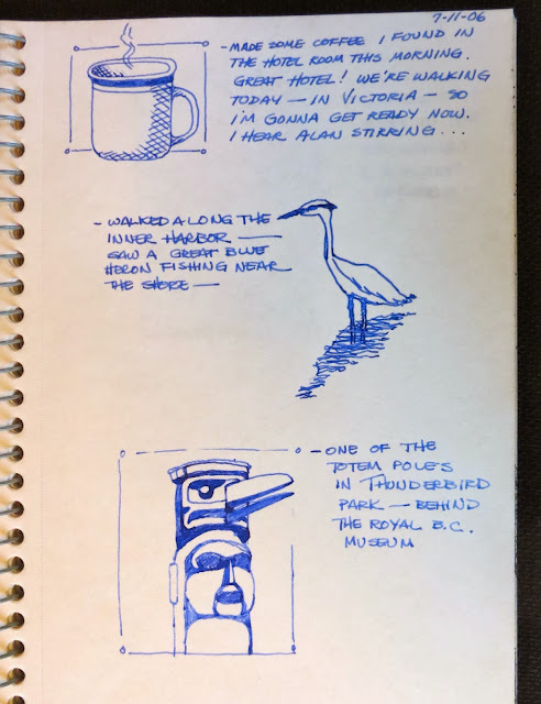
6)  IMPRESSIONS OF YOUR DAY -- Using a blue fine marker, or even a blue ballpoint pen, draw a few images of some things in your environment. And then, jot down a line or 2 next to each one -- all on the same sketchbook page.  Then, date the page . . . 


7)  A "BLUE" BIRD -- 

Draw a "blue" bird, either from life or from a photo, in pencil.  Add color with colored pencils (or watercolor pencils), using different blues, and adding a few spots of warm colors for contrast . . . 


8)  FLOWER DOODLES --

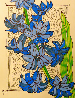
Find pictures of a few blue flowers, or you can use my doodles as reference.  

Now, just start drawing the flowers, shape by shape, with a black felt pen.  Once you're filled up your sketchbook page with your lines, you can add color with markers or colored pencils.


Comedian Larry David, in HBO's "Curb Your Enthusiasm" said, "I can't draw to save my life, but yet, I'm a very good doodler".


9)  BLUE CONTOUR DRAWINGS --

Using a blue felt tip pen, draw one or two contour drawings of something in your home . . . 


10)  JUST FOR FUN -- 

While looking at a stone wall, draw just the cracks, with a contour line in black felt pen.  Choose one of these shapes and turn it into a little creature.  Draw a frame around it with some lines in the background, to break up the negative space.  

Now, try some paint "sanding", in some of the background shapes.  Wet one of the shapes with clear water, and then, rub the end of any blue watercolor pencil on a sandpaper block, so the particles land on the wet shape.  (This only works with watercolor pencils, not regular colored pencils.)


All right!  Now, it's time for a cup of hot tea or coffee -- to warm up after all this COOL BLUE drawing and painting . . . 


LESSON VI - Part 1: Blue Sky Sampler


Draw a grid on one piece of watercolor paper, separating your paper into 4 quadrants.  Or, you can use 4 separate little rectangles of paper.


Paint a different blue sky in each one --

(Upper left quadrant) - Wet the paper first with clear water; then, paint two different blues.  As it is drying, roll a little piece of tissue across the paper, for clouds.

(Upper right quadrant) - Wet the paper; then, paint a pale blue and a very pale magenta.  Then lift out some of the paint with a damp brush, as it's drying.


(Lower left) - Draw and mask out a little circle, for the moon, using masking fluid.  Wait for the masking to dry, and then paint the sky with two different blues.  Roll a tiny piece of tissue across the moon for a cloud.  If the sky is not dark enough for a night sky, wait until it is dry, and paint it again with the blues.  Remove the masking after it is dry.

(Lower right) - Paint a blue wash onto dry paper.  While this is still wet, paint a few "stripes" of another blue.  Roll a piece of tissue for the clouds.  

LESSON VI - Blue


This Lesson is all about cool and calm BLUE, the overwhelming "favorite color".


BLUE surrounds us -- it is the color of peace, order, strength, and the spirit -- symbolized by the blue sky and the vast blue ocean.  BLUE evokes serenity, innocence, truth, sadness.


Here are 10 important things about the color BLUE that I think you should know:


1)  BLUE IS THE COOLEST COLOR ON THE COLOR WHEEL -- bringing a soothing element to any painting.  Of the three primary colors, it is the only cool one.


2)  BLUE VISUALLY RECEDES.  Any color that we associate with the sky -- especially the blues -- tend to be recessive, stubbornly recessive.  Another characteristic of BLUE is its POWER TO SUGGEST INFINITY or DEEP SPACE -- beyond that of any other color.  Because of this, blue is a good color to use for your background, and also as a glaze, in order to set something back in space.


3)  BLUE'S COMPLEMENTARY COLOR IS ORANGE.  Side by side, these two colors create a vibrancy.  Interestingly though, if you put these two colors next to each other, at the same intensity and the same size, the cool blue will still recede, and the warm orange will still advance.


4)  YOU SHOULD HAVE AT LEAST 3 BLUES ON YOUR PALETTE, since all blues are not considered equal.  Blues have what's called a "hue bias", which is the different mixing potential of each blue (whether the color leans towards green or red).  It's good to have a blue with a GREEN BIAS, like a Phthalo Blue; a blue with a RED BIAS, like French Ultramarine; and a good blue for glazing, like Cobalt Blue.  Having a green bias, means that this blue will mix with yellows to make beautiful greens. Having a red bias, means that this blue will mix nicely with cool reds to make violets.


5)  PHTHALO BLUE (also known as Winsor Blue or Rembrandt Blue) is a BRIGHT AND INTENSE BLUE THAT CAN BE VERY DARK.  Used as a thin glaze, it is very transparent.  It is a staining pigment, which means it is hard to lift.  Phthalo Blue can easily overwhelm other colors, unless it is used sparingly.  But, this makes it excellent for mixing darks.


6)  COBALT BLUE IS AN ESSENTIAL BLUE FOR YOUR PALETTE -- GOOD FOR PAINTING SKIES & SHADOWS, BUT NOT GOOD FOR DARK MIXTURES.  I use it a lot for glazing and in portraits.  Cobalt Blue is translucent and lifts easily.  It's also somewhat toxic, by the way.  This is a great all-round color for underpainting, layering, and mixing with other colors -- just not for dark mixtures.


7)  FRENCH ULTRAMARINE -- A SEDIMENTARY COLOR -- CAN BE VERY USEFUL, DEPENDING ON WHAT YOU'RE PAINTING.  Because of its granular quality, it's good for painting beach scenes, landscapes, barns -- but, not for skies and portraits (at least not for the skin).  Use French Ultramarine, mixed with Quinacridone Burnt Orange, when painting rocks, trees, bark, and stone.  

This color is attractive when applied wet-in-wet, because it settles and doesn't spread uncontrollably.  French Ultramarine is a very saturated royal blue, biased slightly toward red, so it makes a beautiful purple.  This color will dry lighter than you think, and it lifts easily.

The highest quality Ultramarine Blue is made with powdered lapis lazuli from Afghanistan.  (Not really important for you to know, I guess, but I thought it was interesting.)


8)  CERULEAN BLUE IS A BEAUTIFUL, LIGHT BLUE PIGMENT THAT CAN ACT AS A TRANSPARENT COLOR, WHEN MIXED WITH LOTS OF WATER AND APPLIED TO WHITE PAPER.  It is not a good color for mixing or glazing/layering, since it is fairly opaque and can be rather chalky in mixtures.  It also has a granular quality, and is a good pigment for spattering.


9)  BLUES MAKE BEAUTIFUL, "COLORFUL" GRAYS.  I know that seems like an oxymoron, but the grays you get when mixing blues and other colors, are so much more interesting than the tube grays.  You're able to "push" the gray towards blue or rose.  You can also apply a cobalt blue glaze over a busy or too-bright background, to gray it a little and calm it down.  Using a blue mixture for your shadows is much more effective and harmonious than just using a Payne's Gray wash, for example.


10)  BLUE HAS A BROAD VALUE RANGE, from tints to shades (unlike yellow, which never gets dark, without turning into brown).  Strong blue hues retain their color identity at the darkest value, and at the lightest value (unlike red, which becomes pink at its lightest value).