For this abstract landscape, we're going for a suggestion of a landscape, rather than a painting of a particular place. So, try not to overthink this -- just enjoy experimenting with the colors and some different "tools" . . .

For this project, gather the following materials: A rectangular sheet of watercolor paper, already stretched onto a board. Watercolor paints -- Aureolin Yellow, New Gamboge, Quinacridone Gold, Raw Sienna, Quinacridone Burnt Orange, and Sap Green. Liquid Acrylics that you can squeeze or apply with an eye dropper -- I used Daler-Rowney Acrylic Ink (Indian Yellow) and Lumiere Liquid Acrylic (Pearlescent Emerald). Don't worry if you don't have these on hand and don't want to purchase them. You can make an intense watercolor mixture of Orange, and another one of Bright Green, in little containers, to be applied with either an eye dropper or the end of your brush. A paper towel or two. A palette knife. And, your brushes and water, of course.
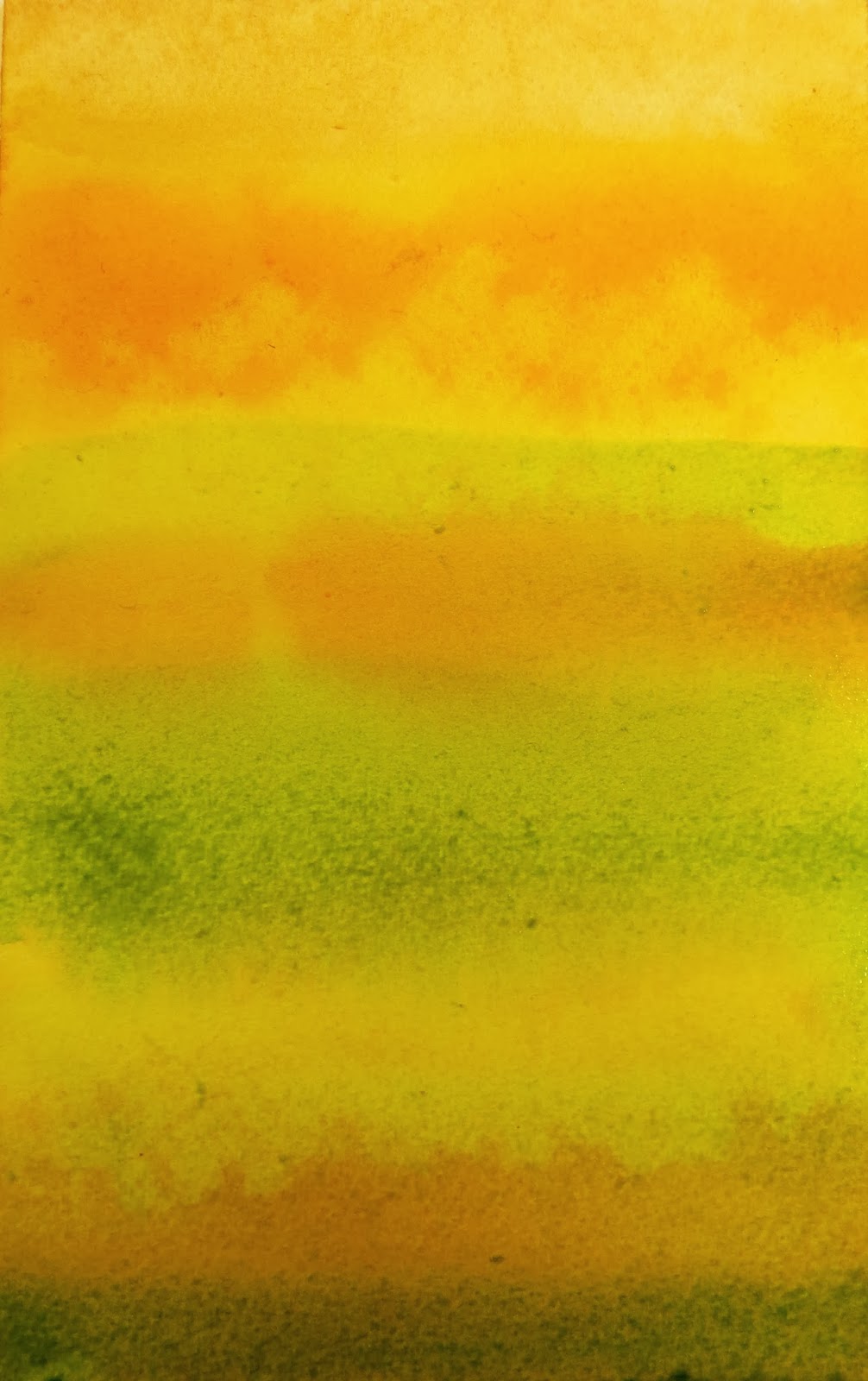
Prep all your "Yellows", for your first wash . . .

Wet the entire paper with clear water, and then apply the different watercolor yellows, in horizontal strokes . . .

While this is still fairly wet, using an eye dropper, or the tip of a brush, drop in some of the Orange acrylic (or your intense Orange watercolor mixture) . . . in a horizontal line, in the top 1/3 of your paper.

To get this to move horizontally, you may have to brush clear water across it, and then hold your paper/board up sideways, so that the paint and water can drip onto your palette . . .

While this is all still wet, add some more horizontal "lines" of your different yellows, to make it all more intense. Then, hold your board sideways above your palette, to let the excess paint/water drip off . . .

Now, tear some strips of paper towels . . .

Lay these strips onto the WET paint, and lightly tap them down with your fingertip. Don't overthink this, either -- wondering whether these are going to be clouds or bushes or mountains. We're doing this just to add some texture and interest . . .

After the paper is dry, peel off the paper towel strips. If any pieces stick, scratch them off with your fingernail . . .

In order to make the texture and contrast a little more subtle, wet the paper again, and paint another wash of one or more of your "Yellows" over the whole painting . . .

While this is drying, mix a wash of Green -- just add Sap Green to the Yellows that are already on your palette. Also, get your "Emerald Green" ready (either the liquid acrylic with dropper, or the watercolor mixture with dropper or brush) . . .

First, decide which end of your paper that you want to be the top of your painting -- the "sky". Then, starting about a third of the way down from the top, wet the paper -- from there down to the bottom. Paint some horizontal "stripes" with this Green wash. Let some of the yellow show through. . .
While this is still wet, drip some of the Emerald Green onto your painting (see how this mixture is more pigment than water?) . . .

Using the tip of a palette knife, drag it through the paint, horizontally. . .

Paint some more horizontal "stripes", using clear water and also the Green watercolor wash. Be sure to NOT cover up all of the Yellow and Gold underneath . . .

While this is still wet, tear some more paper towel strips and lay them down onto the Green wash, tapping them down lightly with your fingertip . . .

After the paint has dried completely, carefully peel off the paper towel strips . . .

Prep two different mixtures: 1) Quinacridone Gold + Quinacridone Burnt Orange; and 2) Sap Green + Quinacridone Gold.
Starting near the top of the Green wash, paint a very wet shape, from the left side of the paper, over to the right side -- using both of these mixtures. Vary the top edge of the shape, so that it gives the impression of trees or bushes in the background.

While this shape is still damp, sweep across JUST the bottom edge of that shape with clear water, in order to soften that edge. A few inches down from that, do the same thing, across the paper (paint a shape across the paper, than sweep the edge of the shape with clear water.)

At the bottom of the painting, paint a few horizontal strokes with Quinacridone Burnt Orange (or Burnt Sienna) . . .

To finish the painting, mix up a dark, using Sap Green + Quinacridone Burnt Orange, and paint a few horizontal stripes, below the middle of the painting. And, add some dark horizontal strokes at the very bottom . . .

Now, sit back and admire your painting. Don't expect it to look exactly like mine. In fact, if you do another painting, following these instructions exactly, your 2nd painting will look different than your first one. Hopefully, you enjoyed the process -- and had fun painting a little differently than you normally would.
No comments:
Post a Comment